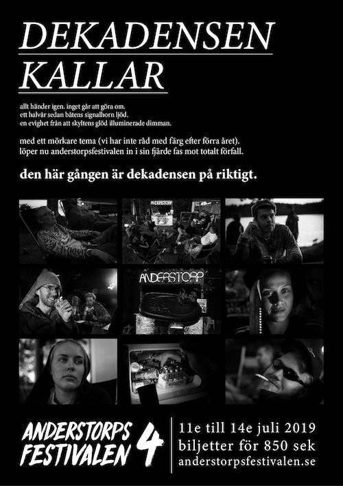
ANDERSTORPSFESTIVALEN 4 Concept
Since the third iteration of this “imaginary festival” almost drowned in a pastell palette, it felt proper to try the opposite for this iteration, which is why we decided to go for all black / white / gray theme this year. Last year had a much darker feeling than two years ago, with the party going much longer into the night with a harder theme overall, so representing this visually would be the key to communicatining our intentions.
Starting out with a simple moodboard, i put together something on the train in August that looked something like this:
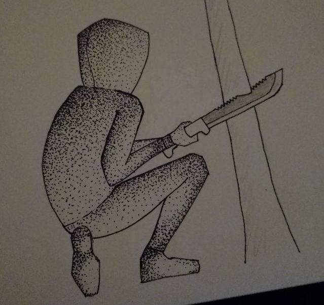
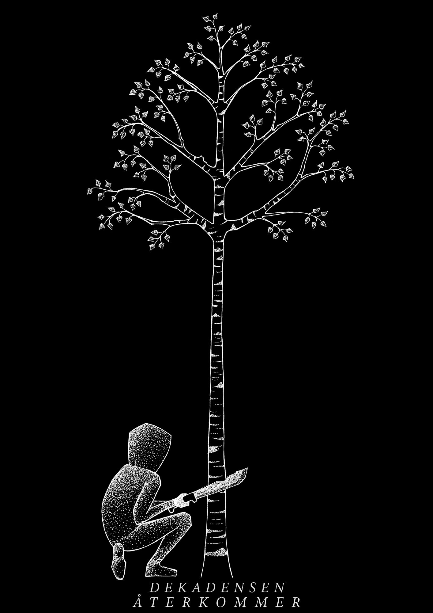
The goal here was to go for a true #000000, even if this is never advised to do. However after considering this theme for a while I asked Johanna to draw soemthing that represented the previous year. One memory that stood out was when one visitor cut down a smaller tree with a large knife, all during less clear circumstances. Johanna started drawing this tree, with multiple iterations of the parts we wanted in the picture. 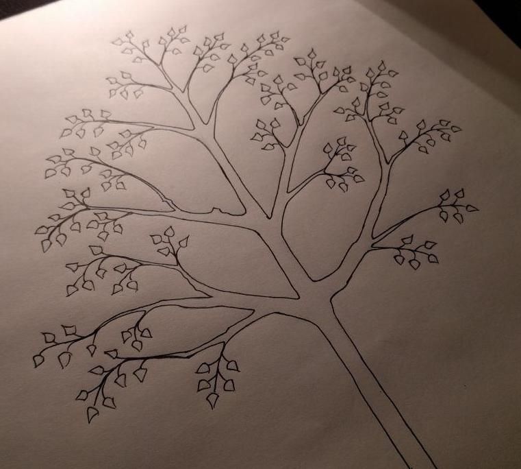
After settling on a specific art style with a heavy focus on clean lines with dotted shadows, Johanna drew the final version of the tree, scanned it and I then processed it in Illustrator to give it a more clean pop, ending up like this:
The tree sort of unlocked the rest of the theme in a way. We decided to double down on the “retro-computing” feeling for the festival theme together with hand drawn illustrations representing the festival. So for the website I wanted to capture the feeling of just being there. I asked Johanna to draw me a nice moon and a bunch of different clouds in similar style. After some experimentation it turned out the moon would work in a similar style but the clouds ended up better in a shaded style. Johanna painted a bunch of clouds on a larger canvas, I inverted it and processed them.
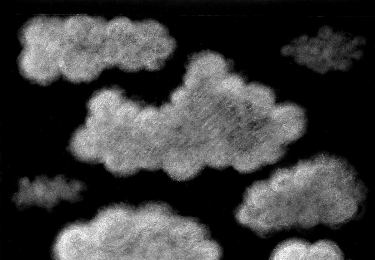
I put it all together on the webpage. Moon, clouds, a animated star bakground and the tree. I found a kind of nifty way of animating/scaling these clouds. By defining the aspect ratio per cloud and applying a animation timeline, they scale perfectly all the way from mobile up to a full size desktop:
  $x1-size: 50vw;
  $x1-ratio: 0.66;
  .x1 {
    @extend %arrow;
    left: -20vw;
    animation: move-cloud 250s linear -5s infinite;

    width: $x1-size;
    height: calc(#{$x1-size} * #{$x1-ratio});
    background-image: url("/assets/img/clouds/1.png");
  }
Each cloud has a offset and a animation timer, which gives the animation a fixed order but still has a natural feel to it.
Here’s a demo of how it looks:
You can view the result atanderstorpsfestivalen.se.